An advert caught my eye this morning for a 12 month maternity cover post as a Cartographic Assistant in Cambridge UK. Salary? £14,000 (maximum) per annum plus a few odd benefits like a clothing allowance (map ties?). Now before I get carried away I appreciate this is for the post of 'assistant' and it's a non-permanent contract but...
That salary is derisory. In my last few years as a lecturer at Kingston University it was becoming increasingly difficult to attract wannabee degree students to courses that blended GIS with mapping and computer science. Mapping has become so pervasive that so many presume it's largely something that just 'happens' and the job market reflects that; there can't possibly be a worthwhile career to be had; and surely it's not worth dedicating three years of study on. We also worked closely with the geo-industry and the story we got from them is that they were finding it increasingly difficult to recruit graduate level talent with geo-skills. Sure, plenty of geography graduates who can staff the local McDonalds but not that many with the skills for a modern mapping job.
When you see derisory salaries such as this you can easily see why the industry is not attractive to people deciding what to choose for their degree and possible career path. A quick look at what graduates earn reveals an average graduate salary of £21,762 and an average non-graduate of £14,801. Geography graduates slightly below average, Computer Science slightly higher. Big bucks for Engineering, Medicine, Dentistry etc... There's clear value in getting a University education and that's without taking account of future earning potential.
Why then, is cartography relegated to the non-graduate pile, particularly as the world now more than ever needs people with skills in understanding and communicating spatial information and who can both build and harness the amazing new mapping tools we have? For what it's worth, my perception is still that far too many sorely underestimate the value they place on quality mapping. They don't really understand what it means to be a cartographer, what it entails and see it as a relatively low-skilled position. We've all heard the jibes about "hasn't the world already been mapped" and that attitude pervades but if companies really want to get serious with their mapping they need to hire people who know what they are doing and can do it well.
So the company advertising this position clearly sees cartography as a non-graduate role. Little wonder, then, that it's tough to persuade people of the value of a University education in GIS/Mapping or a related subject. Cartography, then, will continue to be classed as a largely unimportant and poorly paid job. I pity the person who takes this...a quick look at the Cambridge rental market reveals an average rent of £1,135 per month. Good luck living off your spare £380 for the year...oh, wait, that rent doesn't include Council Tax, Utilities and lattes...debt here we come!

Monday 28 October 2013
Thursday 24 October 2013
A touch too much on house prices
Neal Hudson (@resi_analyst) just published what he describes as a 'detailed map of London house prices':
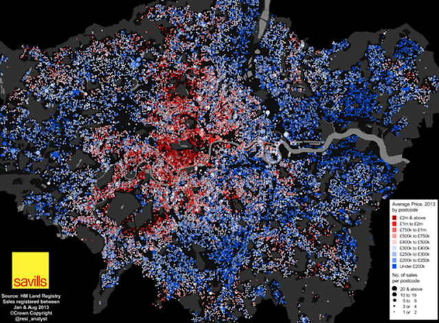
Neal's map struck me as an example of a breed of maps that are becoming pervasive online simply by virtue of the fact that large datasets are more accessible. Is that a problem? No...quite the opposite; the potential for making maps has never been greater though the default approach to mapping large datasets is simply to throw it all on the map. A few years ago this map would have been on a Google basemap with a smothering of red Google markers. We've certainly progressed and Neal's done two things...coloured the symbols to denote average house price and sized them to denote the number of sales. I think he's gone too far.
The number of bits of data you have doesn't make the map 'detailed'. It just makes it 'a lot'. Detail can only be seen if the map's content is legible and so much of it masks itself. We get a broad idea that there are concentrations of higher house prices but that's about it. Where's the context? I know that the areas without any dots are predominantly parks so it's no surprise that higher prices are evident around Hyde Park, Regent's Park or Richmond Park. It's also no surprise that there are lower average prices around the Lee Valley, Heathrow airport or the Thames estuary but unless you know the geography you have no hope of being able to describe the pattern and explore possible relationships with environmental or socio-economic circumstance. So the map sparks interest but you can't actually explore any questions you may have.
I also wonder if removing the house price sales variable and just showing the average house price would be a better idea? Do these two variables actually make sense on the same map? I get why they would but encoding too much in one map is sometimes a touch too much for the map to be able to handle. The symbols are inevitably competing for space because postcode areas in London are small. As soon as the decision was made to map number of house sales by varying the symbol size the problem became almost unmanageable. Sticking with one variable and keeping the map simple might have made the message more striking. Making two maps, side by side may also show some interesting patterns that combining the data masks.
Couple of other carto-quibbles...the red-blue dichromatic colour scheme is clearly a default and going through washed out colours in the mid-range does nothing for the map...but hang on...why use a dichromatic scheme in the first place? The symbols vary around £400k. Is this the average of averages? What is the importance of this critical break in the symbols? I'd wager nothing...so the map would probably work better with a single hue scheme. And what of some other context? How does the London bubble compare to the rest of the UK? Even at the lower end, most London houses are probably more expensive that the average for the rest of the country which might be a useful comparison to state. Finally, and I'm getting into cartonerd detail here...overlapping classes in the legend just needs modifying to avoid the same value appearing to lie in two classes.
Subscribe to:
Posts (Atom)