
NYCHenge by Andrew Hill
The Manhattan Solstice occurs twice a year when the setting sun aligns perfectly with the east-west street grid in New York City. This map could not be any simpler but it captures the phenomena perfectly. Intuitive, interactive controls and a great use of colour allow viewers to explore the way in which the sun splashes across the city throughout the year. Temporal data, perfectly represented with expert use of colour and contrast.

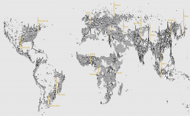
Population Lines by James Cheshire
Global population density drawn as horizontal lines...almost like a cardiograph of the pulse of the world's populus. Not the first map of population that's ever been made but a compelling, alternative and fresh approach. A map that is also a piece of art and the beauty of it's design lies in its simplicity with colour used sparingly and for emphasis. There's an attention to detail that most will overlook that makes this so pleasing to view. Design is implicit.
Tornado Days by Brenden Heberton
2013 saw any number of maps made using NOAA's historical tornado data but this example did a fantastic job of going beyond the map by combining a wide range of multimedia in an innovative way. The reader scrolls down to reveal new facts, new maps and a new layout. This heightens the interest and keeps people immersed in the rich story being told. Maps as a component of a story...expertly collated and combined with related material.

PLUTO is Free! by Andrew Hill
A selection of maps that celebrate the release of New York City's PLUTO dataset. As you cycle through, the range of maps is well matched to each dataset and illustrated with simple, effective and eye-catching approaches. The maps were initially prepared to provide images for projection at a party but as a linear gallery, they work here to highlight not only the data but high quality cartography, professionally applied in a clean UI.

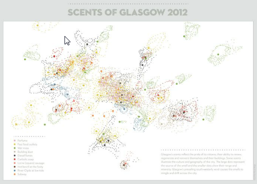
Scents of Glasgow by Kate McLean
Putting the art in Cartography; a visual art installation that combines a map of perceived smells from Glasgow during the winter of 2012 with bottled scents. The idea is to use the map, combined with 9 bottled scents to inform the culture, history, planning and climate of the city. Soap, Bovril, damp moss, sausage all represent synonymous places. The map shows the centre of the smell and how it dissipates using proportional symbols. It's art. It's c'art. It's done beautifully.
Cloudless Atlas by Mapbox
A fresh approach to making a mosaic of NASA's LANCE-MODIS data. Rather than taking the best image of a particular place and then quilting them together, Mapbox stacked images and processed them, pixel by pixel to get the average of the least cloudy pixel before stitching it all back together to create a seamless cloud-free atlas. Completely synthetic but a great example of using generalisation techniques to create a product that is greater than the sum of its parts (literally). Beautiful imagery.

Global Wind Map by Cameron Beccario
Fernanda Viégas and Martin Wattenberg's Wind Map of the USA was one of the best maps of 2012. Here, a similar approach is applied globally for near real-time data. A mesmerizing, beautiful depiction of global weather patterns though the serene nature of the map belies the potential power and savagery of the mapped theme. Intuitive UI and some simple and useful ways to modify the view. Neat.

Collins Crossworld Puzzle by Kenneth Gibson and Kathryn Kelly (Collins Bartholomew)
The world map...as a crossword. That makes it a crossworld. Geddit? Such a simple idea and a well crafted design with clues that broadly fit the locations of their position on the map. Sometimes the simplest of ideas can turn into the most effective of maps. Interaction is implicit. The classic black and white print crossword depiction is favoured and thankfully the temptation to colour continents was ignored. Great work.

The Next Big Spill by Lauri Vanhala
Beautiful production on this video of marine traffic in The Baltic Sea gives the map a cinematic quality. The map is the main actor but the supporting cast of captions makes it easy to understand. The map provokes a questioning approach to what you're seeing. The zooming, panning and soft-focus gives the map a strong aesthetic and the use of a sensible soundscape adds to the atmospheric approach.

Restless America by Chris Walker
Proving that a map doesn't need to take a conventional form, here a chord chart shows the inter-state migration of people in the US in 2012. Good use of size to conotate magnitude and colour to enable differentiation between the States. Simple mouseover interaction means viewers don't get RSI through having to click everywhere. Trying to put this information onto a map wouldn't work as it'd be too overcrowded. This woks. Simply.

Khumbu Himal by Institute of Cartography at TU Dresden
Classic mountain cartography gets a refresh. There's a new colour scheme to go alongside the additional topographic detail derived from new surveys and satellite imagery. The lineage of classic Imhof-inspired depiction of mountain terrain is evident but the colours have been tweaked to give even clearer lines. The detail is breathtaking and although the map is abstract (the earth doesn't actually look like that of course), the colours and symbology give you an unparalleled sense of place.

I've probably missed a few but these are the ones I remember so on that basis alone they obviously registered somewhere in my mapping subconscious. Agree? Disagree?
What can we expect from 2014? World Cup Maps....probably as cartograms.
No comments:
Post a Comment