
My impression of much of what we've seen in 2014 is that web mapping is maturing. Neo is not so neo any more. There are still plenty of ghastly mashups, nonsensical efforts and collections of '40 maps that will change your mind on something you never cared about anyway' but there's better quality too. While 2013 seemed to be the year when everyone was simply trying to out-score each other with different map styles, 2014 has seen less of that trend. Perhaps we're getting a little bored of the fact you can colour in your map a million different ways. Maybe we're moving a little away from the preoccupation with form (nice to look at) and beginning to see function reappear as a key reason for a map to be made.
The trend of mapping data from social media does, however, seem to be continuing unabated. Most commentators agree that Twitter data, for instance, is just plain dreadful with so much error, bias and uncertainty as to make it practically useless for teasing out meaningful trends. I've yet to see a well made map of Twitter data though technologically we're seeing some impressive data processing efforts to get the data on the map. It's a start but finding more nuanced ways of revealing something useful needs to be the next step.
Big data is still a buzzword but so often used inappropriately. As one of my colleagues said earlier in the year "if it fits on a portable drive it isn't big data so #$%* off". Maps are not exempt from the trend to simply map more and larger datasets and a key challenge is to re-think ways of representing millions of features on a map so as to make the map readable and to encode some message or meaning into the map. It's simply not good enough throwing a whole heap of data onto a map and expecting it to work, just because it's technically feasible to do so. Without cartography it's just a visual data dump even if you've coloured it in.
That brings me onto cartography in general. We're still seeing a marginalisation of cartography and cartographers by the avant-garde, the so-called new mapmakers. They seem, generally, to be more comfortable and less combative in the mapping space than a year or so ago (maturity again) but recognising so much of what has gone before still seems to elude many and they're still fond of reinvention. On the other hand, it's also true that cartographers still fail in reaching out and explaining their craft more widely. We are experts in our art and science and have a duty to share that with a society hungry for maps and mapping but I still see far too many who just sit back and watch from the sidelines. How many blogs do you see from real, proper cartographers? Why do we still hide good quality cartographic research in academic journals? This latter point may seem somewhat ironic given I just stepped down from editing one such journal but I've become increasingly uncomfortable with the journal as a sole means of disseminating research. If you've got something to say - say it to the people who need to know; and they're likely not the ones reading that academic journal. That said it's been pleasing to see some recent changes to how news-related blog sites report on cartographic work. There's less of the hysterical reporting of some latest greatest map (that likely isn't) and some good reporting of real cartographic work. Citylab have been doing this well recently.
2015 should see more development in the 3D space with improvements in the way in which data can be visualized more easily and responsively in web browsers. This being the case, it's incumbent on us to properly harness the potential of 3D and not simply use it for the sake of using it. In the same way that I've yet to see a real use for Torque animations (flashing lights showing where people tweet being the biggest culprit...stop press, actually this use showing Alcatraz escapee survival chances begins to use it meaningfully) it's also true that 3D is often used for no good reason. If data is truly temporal and has important characteristics that a temporal depiction can show then design to show that. If there is value in delivering the data to make some additional and purposeful use of the third-dimension then great - but there's more pitfalls to mapping both the temporal and third dimensions that need to be assessed to make the map work.
I'd also like 2015 to be a year in which cartography becomes just a little more recognised for its worth as a discipline and a profession. It seems we've been trying to get everyone to think and work like cartographers for years but I'm not convinced this is the right approach. They're all busy trying to be professionals in their own areas. It also seems that for this to work, it would require a very rigid rules-based approach to allow people to follow to get to the end map (literally mapping by numbers). While many cartographic rules (I prefer to call them guidelines) exist to lead people down the right path, experimentation is playing a big part in modern cartography. It always has if truth be told. Some of this is in the academic space; some in the hacking space; but both modes of design and production are useful. Cartography is a profession and cartographic professionals are knowledgeable and practiced. They have a lot to offer. I firmly believe collaboration is key and I've long said that there's an important distinction between a professional and an amateur in any discipline or profession. I don't use the word amateur in a derogatory sense either - it's used to differentiate someone who is not formally trained, educated or practiced in a particular realm. We're all professionals at something and we're all amateurs at far more besides. Recognising that and collaborating with professionals from another area is likely to yield results that are greater than the sum of the parts. It might also save you time and frustration!
In a personal sense I made a frivolous map this year (the Proclaimers 500 miles nonsense) that got more hits to my blog (12,000) than virtually everything else I have ever done put together. It's possibly the worst piece of work I've ever done. It's not even a proper map. That's how frustrating and disappointing the internet can be.
So with that mini-review/rant out of the way, let me run through a few of my favourite maps from 2014. I was politely waiting for others to post their own lists but I got bored waiting so thought I'd rustle up my choices. They're an eclectic set but as I've spent the year writing a daily blog on the ICA Map Design Commission blog it's been a relatively easy process to narrow down my favourites this year.
In Flight by Kiln (click image for web map)
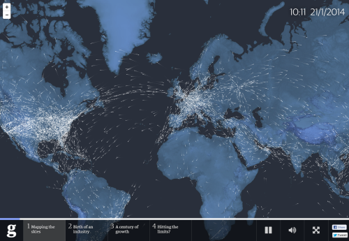
The idea of telling stories with maps is not new. The re-emergence of this genre through the medium of the web with the compilation of related multimedia to create a narrative has been a big story itself in 2014. This effort in The Guardian's web site remains one of the best framed I've seen. Simple idea. Good content. Not over-produced.
Barclays Cycle Hire by Ollie O'Brien

Ollie's been doing some great work with the London Bicycle hire data, particularly with some online mapping. I really like this static representation which BMJ used the map as their cover art to highlight a paper that explored the health benefits of the bikeshare scheme compared to other forms of transport. It's a simple flow map but simple often works very well and the saturated red of the routes is a clear metaphor for a blood capillary network and resonates well as cover art. Ollie even chose to exclude all other detail except for the iconic River Thames in the style of Beck's underground map.
Tokyo by Benjamin Sack

A black and white, printed map. There's still space in a list like this for a terrific perspective drawing of Tokyo that when viewed close-up shows incredible detail. No fancy web controls here...just beautiful cartography that builds off a fine legacy of illustrative bird's eye views.
Breathing City by Joey Cherdarchuk

A simple concept that does manage to use animation to good effect to show how New York City's population structure changes over a 24 hour period. There's a lot of data in here but it's represented with clarity and the animation brings to life the ebb and flow. the moving graph helps to contextualize the work.
One dot for every Starbucks by David Yanofsky

Mapping cities at the same scale is important to support the cognitive process of visual comparison. It's as simple as using the right projection...or using small multiples and mapping the same phenomena at the same scale. I like the way small multiples supports the process of visual comparison in this map. It helps that there are so many Starbucks outlets that the structure of each city is well defined.
NYC Taxis: A day in the life by Chris Whong (click image for web map)

A large dataset brought to life by focusing on a single entity at a time. This moving map takes you on a journey of a single New York City taxi cab. It shows a range of useful information including fares and a timeline. A lovely piece of work that works well, marries form and function and shows us what web mapping can be.
The United States: Her natural & industrial resources by Stephen Smith

Stephen based his modern version of the U.S. on a mid-century map of the United Kingdom. He did so with a keen eye and shows that modern maps don't have to constantly reinvent to be eye-catching and purposeful. He perfected a beautiful aesthetic and gave life to his data.
Skintland by The Economist

You can't beat a bit of satire in cartography and the shapes of maps gives artists a perfect canvas upon which to create something new and provocative. The Scottish vote for independence was too good an opportunity to miss and The Economist did a great job in creating this satirical map for their front cover.
The Milford Track by Roger Smith/Geographx

Pseudo-natural looking depiction supports this map's primary function for wayfinding. It's a map for walkers. The fact it's printed on rock (yes, rock!) makes it practically indestructable as well. The hill-shading and deep, rich colours gives this map a somewhat unique visual appeal but different is good in this case. Fine, detailed contour lines and expertly designed and positioned typographic elements makes it work well as well as looking great.
Canyonlands National Park by Tom Patterson

Tom Patterson's beautiful cartography once again shines in this exquisite depiction of the terrain morphology and colours of the landscape. Realistic rendering of the terrain captures not only the vertical component but also something of the horizontal structure and bedding to give an impression of rock texturing synonymous of historic, manually drawn relief and rock shading. There's a lot going on in the creation of this map but the devil is in the detail and it's the detail that makes this so easy on the eye.
London: The Information Capital by James Cheshire and Oliver Uberti

Not a map...but a book of maps. This really is a stunning collection of beautiful maps about all manner of different aspects of London and its populus. Each map has been carefully crafted to make the best use of the data and to speak to the theme of the map itself. Picking out one or two maps doesn't do it justice so here's a tip - go buy it. This is modern thematic cartography at its absolute best.
This is a top ten of sorts but honourable mentions to the following which on another day I might have easily put in this list:
Plan oblique relief Europe by Jonas Buddeberg, Bernhard Jenny & Johannes Liem
Space Station Earth by Eleanor Lutz
Columbia River watershed by Jake Coolidge
Lake Wakatipu by Simon Bardsley
All of these maps have got a fuller write-up on the ICA Map Design Commission blog this year. They contain large images and links where appropriate.
That's it for 2014, unless someone publishes something fantastic in the next 15 days. I'm also looking forward to everyone else's lists. They're bound to be different which is part of the subjective beauty of cartography. I'm also likely to have missed some.
